Booking emails need larger gap
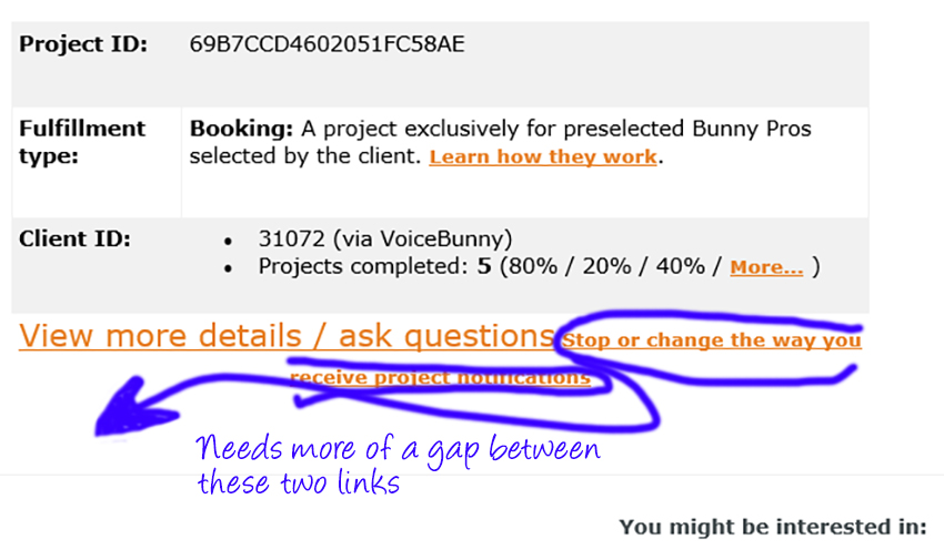 For those of us who use tablets in the booth and have thicker fingers, it would be much easier to click on the View more details/ask questions link if there were greater separation between the "Stop or change..." link right below it.
Thanks!
C=
Please sign in to leave a comment.
Thank you for your suggestion, Chuck! Definitely makes sense.
Will pass the idea on so we can fix this!
Just wanted to point out that this has never been fixed. The lines are still jammed up against each other, and still end up taking me where I don't want to go sometimes as a result.
best,
c-
Hi Chuck
As this issue is not an urgent problem, it's on the backlog of our ideas. Keep in mind that this problem doesn't affect all our users for which we focus on creating ideas and features that would provide a greater benefit or that pose a bigger problem.
We will work on it, however, it may take some time as we need to review the whole layout of the email.
Hope you can see where we're coming from.
Fair enough. Obviously, I have a different perspective. But I certainly understand that you need to set priorities. I was unaware that you were going to refresh the whole layout.
Thanks for your response!
C=
Thank you for your patience, Chuck! We really appreciate all your ideas :)